In this guide, we’ll be looking at the basics of Flexboxes and learn how to create a 6 column responsive grid.
Grids are essential to building site layouts, sidebars, arranging content, etc. It’s nice to be able to have content presented side by side if screen size permits it. If the screen is too narrow, it will stack the columns on top of each other, so users can scroll down to see the contents of the following column.
There are many ways to create grids. Web designers used to create grids with tables. This presented a number of challenges, especially when designers needed to think about creating responsive designs. So table-based layouts are no longer popular or in regular use. CSS grids created using rows and columns then became popular. More recently, in the past decade, Flexbox has become an essential tool in grid design. It supports a number of useful features, such as growing and shrinking content to fit displays, justifying content, spacing content, and ordering items. Flexbox is now supported on all modern browsers (Chrome, Firefox, Safari, Edge, Mobile).
The grid will be created in a way such that there will be six column sizes, col-1, col-2, col-3, col-4, col-5, and col-6. You will be able to combine any set of columns into a row, so long as the row is no more than 6 columns wide.
When there are more columns than 6 columns, the next column will wrap down to a new row.
When it’s done, we’re going to be able to create columns like this:
<div class="flex-container">
    <div class="col-2">
        <p>Contents of first col</p>
    </div>
    <div class="col-3">
        <p>Contents of second col</p>
    </div>
    <div class="col-1">
        <p>Contents of third col</p>
    </div>
</div>Code language: HTML, XML (xml)
The above code would create a layout like the second container in the above “what we’re making” picture.
The Container
The container will be a class with the display property set to flex. This allows us to use flexboxes in this container.
Another property, flex-wrap, allows us to set the wrapping of our flexboxes. We want our flexboxes to wrap to the next row when they run out of space in a 6 column layout. For example, if there were three col-2s and one col-5, the col-5 would wrap to the next row.
It should look like this in the CSS:
.flex-container{
    display: flex;
    flex-wrap: wrap;
}Code language: CSS (css)
The Columns
Next up, we have to define widths for each of the column classes. We’ll do this using the flex-basis property, which attempts to set the “basis” for the width of the flex item. Since this is a 6 column layout, we want each column to take up 1/6 of the space in the container. We cannot set the width of the column to 1/6, as fractional values are not supported in CSS. Instead, we have to use percentages. While some browsers do support decimal places in percentages, the behavior is different between different browsers. Therefore, it is best to use whole number percentages in our widths. 1/6 is 16.666 percent, so we will use 16% as the width of each column. We don’t want to use 17%, as 17×6=102, which is over 100%.
Create classes for each column and set the appropriate widths. The first will be 16, second 32, third 48, and so on.
.col-1 {

    flex-basis: 16%;
}

.col-2 {

    flex-basis: 32%;
}

.col-3 {
    flex-basis: 48%;
}

.col-4 {
    flex-basis: 64%;
}

.col-5 {
    flex-basis: 80%;
}

.col-6 {
    flex-basis: 96%;
}Code language: CSS (css)
Test It
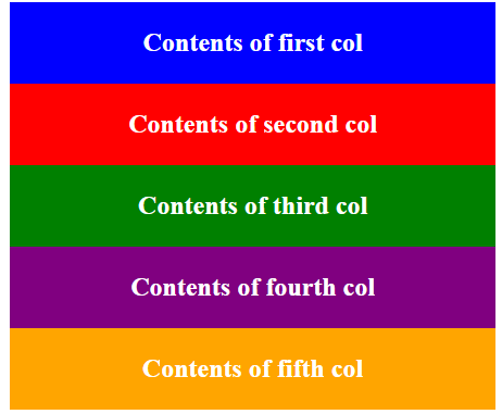
Now that we have our flexbox grid and columns set up, we can test it out. I have created some HTML that looks like this, for testing purposes. The expected behavior is 3 div columns in the first row with widths of 2, 3, and 1, a second row with one 5-column wide div, and a third full-width row.
I have added inline background colors to each div so we can see what space each one is occupying.
<div class="flex-container">
       <div class="col-2" style="background: blue;">
           <p>Contents of first col</p>
       </div>
       <div class="col-3" style="background: red;">
           <p>Contents of second col</p>
       </div>
       <div class="col-1" style="background: green;">
           <p>Contents of third col</p>
       </div>
       <div class="col-5" style="background: purple;">
           <p>Contents of fourth col</p>
       </div>
       <div class="col-6" style="background: orange;">
           <p>Contents of fifth col</p>
       </div>
   </div>Code language: HTML, XML (xml)
When I preview it in my browser, it looks like this (I have centered the text and made it white for added clarity)

Since all of the column widths are multiples of 16, their edges will always line up with each other. When over 6 columns are used, they successfully wrapped to the next row.
Making It Responsive
We can make it responsive using a simple media query that checks if the screen width is less than a certain given pixel value. The standard mobile breakpoint is 480px, so we will be using this number in our media query. If the screen is less than 480px wide, we will set the width of each column to 100%. This will cause the columns to stack on mobile.
/*Responsive Cols*/
@media only screen and (max-width: 480px) {
    .col-1, .col-2, .col-3, .col-4, .col-5, .col-6{
        flex-basis: 100%;
    }
}Code language: CSS (css)
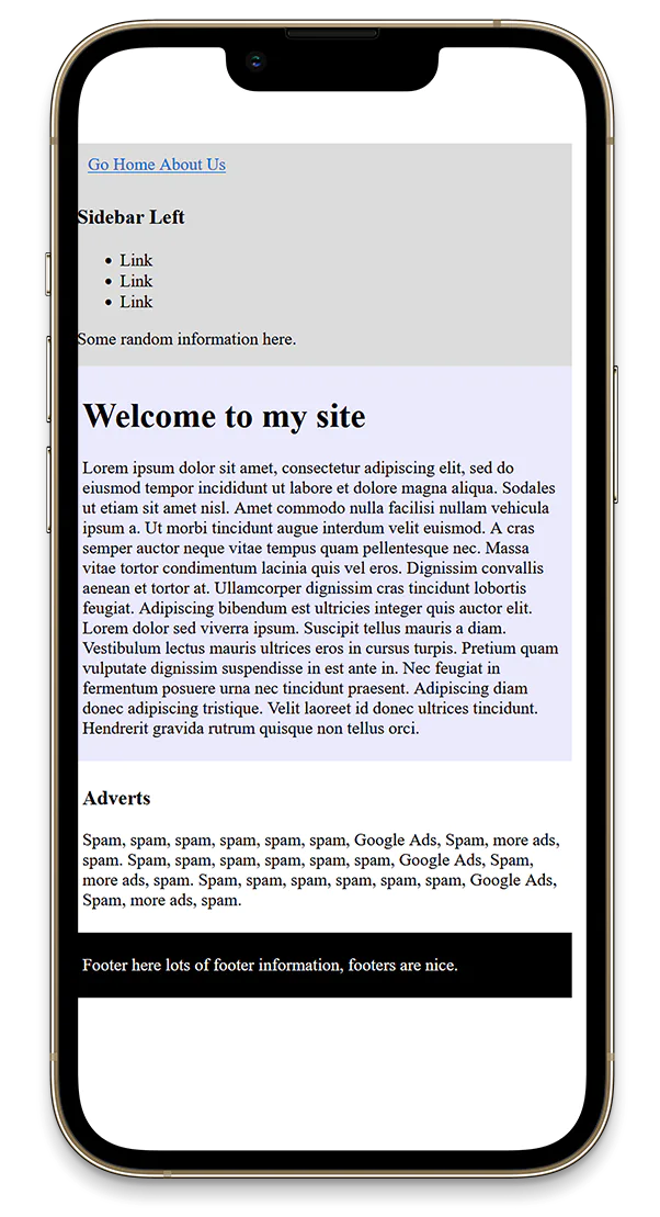
Now when I view the site with a width less than 480px, it looks like this:

Real World Use Cases
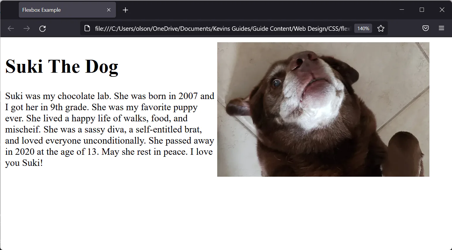
Some examples of where you might want to use responsive grids like this include site layouts, content layouts, and more. For example, if you want to show an image to the right of some text on wide screen devices, but stacked on mobile, you could do something like this:
<div class="flex-container">
  <div class="col-3">
    <h1>Suki The Dog</h1>
    <p>
      Suki was my chocolate lab. She was born in 2007 and I got her in 9th
      grade. She was my favorite puppy ever. She lived a happy life of
      walks, food, and mischeif. She was a sassy diva, a self-entitled brat,
      and loved everyone unconditionally. She passed away in 2020 at the age
      of 13. May she rest in peace. I love you Suki!
    </p>
  </div>
  <div class="col-3">
    <img src="/suki.webp" alt="Pic of doggo" />
  </div>
</div>Code language: HTML, XML (xml)

Site Layouts
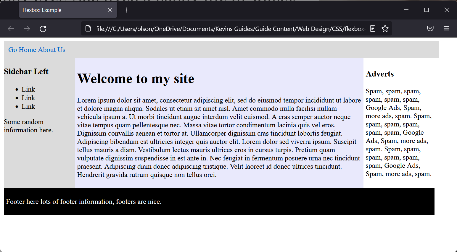
This grid could also be used as part of a site’s template. For example, if you wanted to have two sidebars on the left and right, and the main content in the middle, it might look like this:
<body>
    <div class="flex-container">
      <div
        class="col-6"
        style="background: rgb(219, 219, 219); color: white; padding: 10px"
      >
        <a href="/index.html">Go Home </a>
        <a href="/about.html">About Us</a>
      </div>
      <div class="col-1" style="background: rgb(219, 219, 219)">
        <h3>Sidebar Left</h3>
        <ul>
          <li>Link</li>
          <li>Link</li>
          <li>Link</li>
        </ul>
        <p>Some random information here.</p>
      </div>
      <div class="col-4" style="padding: 5px; background: rgb(233, 233, 252)">
        <h1>Welcome to my site</h1>
        <p>
          Lorem ipsum dolor sit amet, consectetur adipiscing elit, sed do
          eiusmod tempor incididunt ut labore et dolore magna aliqua. Sodales ut
          etiam sit amet nisl. Amet commodo nulla facilisi nullam vehicula ipsum
          a. Ut morbi tincidunt augue interdum velit euismod. A cras semper
          auctor neque vitae tempus quam pellentesque nec. Massa vitae tortor
          condimentum lacinia quis vel eros. Dignissim convallis aenean et
          tortor at. Ullamcorper dignissim cras tincidunt lobortis feugiat.
          Adipiscing bibendum est ultricies integer quis auctor elit. Lorem
          dolor sed viverra ipsum. Suscipit tellus mauris a diam. Vestibulum
          lectus mauris ultrices eros in cursus turpis. Pretium quam vulputate
          dignissim suspendisse in est ante in. Nec feugiat in fermentum posuere
          urna nec tincidunt praesent. Adipiscing diam donec adipiscing
          tristique. Velit laoreet id donec ultrices tincidunt. Hendrerit
          gravida rutrum quisque non tellus orci.
        </p>
      </div>
      <div class="col-1" style="padding: 5px">
        <h3>Adverts</h3>
        <p>
          Spam, spam, spam, spam, spam, spam, Google Ads, Spam, more ads, spam.
          Spam, spam, spam, spam, spam, spam, Google Ads, Spam, more ads, spam.
          Spam, spam, spam, spam, spam, spam, Google Ads, Spam, more ads, spam.
        </p>
      </div>
      <div class="col-6" style="background: black; color: white; padding: 5px">
        <p>Footer here lots of footer information, footers are nice.</p>
      </div>
    </div>
  </body>Code language: HTML, XML (xml)

This concludes the guide on basic flex layouts. Note that there are many other ways you can create flex layouts, this is just one way.
You can also use a CSS Framework like Bootstrap, or a design system like Tailwind CSS.