
Responsive Images
Users may view your site on anything from a giant 4K television to a small smartphone screen. It’s important that your photos, diagrams, illustrations, and so forth are responsive and look great on as many device types as possible. In this guide, you will learn about key considerations when editing and sharing responsive images on your website.
This guide is more about properly displaying responsive images across multiple screen types. If you want to learn about image file formats, check out the guide on web image formats.
The Simplest Way
The easiest way to make your images responsive is to add a max-width property of 100% to all your images using a CSS rule.
/*make all images responsive*/
img{
	max-width: 100%;
	height: auto;
}Code language: CSS (css)
This rule works for many situations. It will automatically shrink an image down to the size of its container. Suppose you have a container that’s 500px wide and there’s an image that’s 750px wide within it. It will automatically resize down to the 100% width. Height scales with width using height: auto;. Now suppose you shrink your browser window further and the container has a width of 300px. The image width stays at 100%, so it’s now also 300px wide. Finally, suppose you have an image that’s 300px wide in a 500px wide container. The image will not scale up to fill the 500px container, it will only fill the 300px of space it needs to display in full resolution.
Demo
The image below is 500px wide. By default, the box it’s in is 400px wide. If you resize the box and make it narrower, the image will shrink. If you make the box wider, the image will expand until it reaches its base width of 500px.
At the very least, implement the above styling to make your images responsive. However, there are many other things we can do to improve on this.
Handling Multiple Resolutions (Easy Way)
It can make sense to send a 700KB high resolution cover photo to a 4k monitor. However, sending the same image to a 4 inch smartphone over a 3G internet connection is not the best idea. Meanwhile, if we send a low res image to a 4k monitor and stretch it out across the whole screen, it’s going to look pretty bad.
Thankfully, there are ways to serve different image files to different users based on their current viewport. Users loading the site on high resolution screens get the high res image and users on smaller screens get the faster loading lower res image. This will give your users a nice experience across all device types.
With Srcset and Image Width
The simplest way to serve multiple variants of the same image at different resolutions is by using the srcset attribute in a traditional img element.
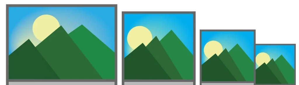
We define the locations of our images, along with their width (in resolution pixels, not viewport pixels), as a comma separated list within srcset.

The example before you is of a mountain range. It contains three images in the srcset. They have widths of 400px, 800px, and 1400px respectively. We tell the browser this based on the ‘w’ information added after each image location is set. You should see a number in the upper left corner of the image. I added this to easily see what size image is loaded for testing. If you’re on a laptop or desktop browser, you probably see 800 or 1400 there. Try resizing your browser down to a narrow view and reload the page. It should load the 400px version instead. If you’re on a retina/high density display, it will probably always load the 1400px version.
<img src="/images/mountains-400w.jpg" srcset="/images/mountains-400w.jpg 400w,
            /images/mountains-800w.jpg 800w,
            /images/mountains-1400w.jpg 1400w"
    alt="a picture of some mountains">Code language: HTML, XML (xml)
If the browser does not support srcset, the old img src attribute will load the image.
...mountains-400w.jpg 400w,
Pay close attention to the numbers with w’s coming after each image in srcset. The image file name itself does not tell the browser what the width is, although I usually include it for my reference. The browser determines what image to load based on the width of its viewport, the pixel density of the screen, and the ‘w’ value following each image in the srcset. This w value should be equal to the natural width of the image. The file “mountains-400w.jpg” above has a width of 400 pixels. The browser knows it’s 400 pixels wide before it loads it because it says “400w” afterwards.
How The Browser Selects Images
The browser will decide the best image to load based on its current total viewport width and the pixel density of the display.
For example, if you’re viewing a page in a desktop browser with a viewport width of 800px and a viewport scale of 1x, as you might on a typical 20-something inch 1080p monitor, the browser will try to load a 800w image, or the next size up if one’s available. If I shrink the width of my browser down to below 400px in width and reload the page, it will load the 400px image.
Device Pixel Ratio
All devices have a Device Pixel Ratio (DPR) which is used to help determine the overall resolution or pixel density of the display. For example, a 27 inch 4K display has a much higher pixel density than a same-sized FHD 1080p display. A 4k display is usually 3840px wide and an FHD display is 1920px wide. The DPR of the 27″ monitor will probably be set at 1x. The 4K display would have a DPR of 2x, since it needs to double the width and height of everything on the page to preserve the overall layout and size. If it didn’t do this, the website would look very tiny on the 4k display. The browser considers the DPR when deciding which image it should load.
Consider the iPhone 13, which has a browser viewport px width of 390. The actual resolution of the screen is 1170 pixels wide. This device has a high pixel density, despite targeting a layout with a width of 390px. The DPR used by the iPhone 13 is about 3x. The iPhone will choose to load the largest, 1400w image rather than the 800w or 400w image, since it’s the closest to the resolution of its screen without sacrificing quality.
The browser prefers to load a larger image and shrink it down to the desired size rather than take a smaller image and enlarge it. For example, if you have a device with a viewport width of 500px and a scale of 1x, and you’re giving it the option of loading in a 400w image or a 600w image, it will pick the 600w image rather than the 400w image.
What if browser width changes?
Once an image is loaded from srcset, it may or may not change depending on if the user resizes their window.
If it began by loading a high res image at a viewport width of 1000px, it will not re-download the file in 800w and 400w formats as the user shrinks their browser window. However, if the user expands their viewport, and they started with a smaller image, it will download the higher resolution images as each threshold or breakpoint is crossed, replacing the lower res image.
When you are testing changes between window resizes, reload the page after resizing the window.

With Srcset and DPR Values
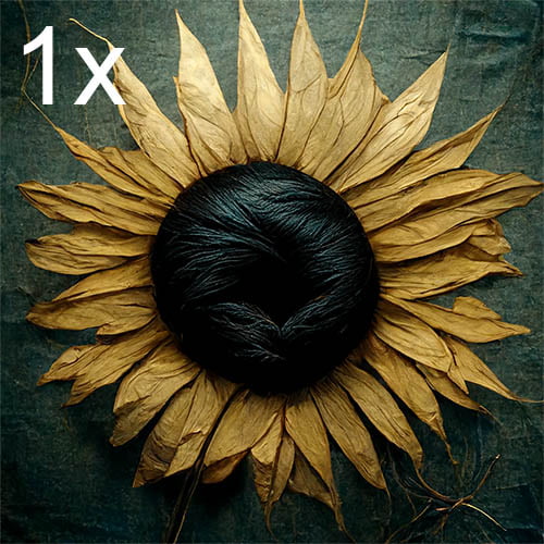
Another alternative to the ‘w’ sizing method shown above is to use DPR values. For example, if my base image is 500×500 at a display pixel ratio of 1x, I could make a 2x image that’s 1000×1000, a 3x image that’s 1500×1500, and even a 4x image that’s 2000×2000. The DPR/scale factor is based on length, not area. A 100×100 (area 10K pixels2) image at 2x is 200×200 (area 40K pixels2), twice the length and width, NOT twice the area at 144×144 (area 20K pixels2).
This is best for images that always occupy roughly the same amount of space on the user’s screen. For example, a 500px wide image we want to always position to the right of some text in a 1000px wide container.
Let’s continue with this working example of a 500×500 image at 1x scale. Say I want it to scale 1x, 2x, and 3x DPRs. I must start off with an image that’s at least 1500×1500 in resolution, or it’s pointless. I then save the original 1500×1500 image as myimg-3x.jpg so I remember it’s the bigger one. I use PhotoShop or my favorite editing tool to scale it down to 1000x1000px and save it as myimg-2x.jpg, then finally 500x500px and save it as myimg-1x.jpg.
The code for displaying the image in browser looks like this:
<img src="/myimg-1x.jpg" width="500" srcset="/myimg-1x.jpg 1x,
        /myimg-2x.jpg 2x,
        /myimg-3x.jpg 3x"
alt="a picture that scales">Code language: HTML, XML (xml)
Now, rather than basing the image loaded off the viewport width, the device will load whichever image suits the pixel density set by the device manufacturer, or in the device settings.
Dev Tip!
You can preview different DPRs in Chrome Developer Tools, Toggle Device Toolbar/view, and then select “DPR” from the top (ellipsis menu -> show device pixel ratio if you don’t see the dropdown).

I generated the image of the sunflower below following the above example. A number displayed in the top left of the image shows what DPR you’re viewing it with. If you view it on a 1080p laptop or desktop monitor, it’s probably 1x. If you’re using a higher-resolution device, it’s probably 2x or 3x.
One potential issue of using this option is if you’re trying to have images fill their containers. Say you have a layout like the one below, which fills the image to the size of a wider container, or up to 800px.
If you’re viewing this on a mobile device or high res screen to begin with, you might not notice this problem. But if you’re viewing from a desktop with 1x scaling, chances are the width of the container is actually greater than the width of the 1x image. The 2x or 3x image might actually look better here, but it loaded the 1x since that’s what is set at the browser level. We can resolve this by switching back to the ‘w’ width values instead of the ‘x’ scale values in srcset.
Key Takeaways:
- Use the srcset attribute on an img element if you want to display the same exact image at multiple resolutions.
- You must provide a comma separated list of images and their sizes in the srcset attribute.
- Define the image width along with the image in the srcset with a w following the image location.
img-small.jpg 400w,for example. - Use DPR scale values like 1x, 2x, 3x, for images that remain a consistent size on the screen, and don’t need to scale up/out to fill containers.
The Sizes Attribute
In addition to srcset, you may use the sizes attribute to tell the browser how wide an image will be relative to the size of the viewport, before it loads the image. This allows you to have greater control over what images are served to different browsers.
The general format for using the sizes attribute within a source element is as follows:
<source srcset="/[IMAGE-SMALL] 250w, /[IMAGE-MED] 500w, /[IMAGE-LARGE] 1000w"
    sizes="([MEDIA QUERY]) [SIZE_ON_PAGE], ([MEDIA QUERY]) [SIZE_ON_PAGE], .n.. , [DEFAULT_SIZE]"
>Code language: HTML, XML (xml)
Example
For example, if you have an image that’s going to occupy 1 of 4 columns in a layout, and your viewport width is 1000px, you’d want to load an image that’s around 250px wide, not an image that’s the full 1000px wide. Examine the diagram for an overview of how it works.
<img src="/pic.jpg" srcset="/images/pic-small.jpg 500w, /images-pic-med.jpg 1000w,
            /images/pic-lg.jpg 1500w"
        sizes="(max-width: 800px) 95vw, (max-width:1500px) 25vw, 500px"
alt="desc">Code language: HTML, XML (xml)
The vw unit stands for view-width. It’s a number relative to the width of the entire viewport, out of 100. The sizes attribute above is saying: If the viewport width is up to 800px wide, expect the image to take up almost the full width of the page. If it’s over 800, but under 1500, expect it to take up about 25% of the page, if anything else happens, the image will be a constant 500px wide.

Sailboat Example
Consider an image of a sailboat. I have two sizes available, 1024w and 512w. Say the image is in a container that occupies a third of the width of the viewport on desktop. The user’s viewport is 1200px wide and their device has a DPR scaling factor of 1x. That means the image only needs to be 400px wide. The 512px wide image should be suitable.
Since we never told the browser ahead of time, the browser will load the image based on the total width of the user’s viewport, not just the space the image will occupy. In this scenario, it would load the full 1024w image and squeeze it down into the 400px wide container after it’s loaded.
In order to get it to download the 512w image instead, we can use the sizes attribute.
Examine the code below, which contains two images of a boat, along with the sizes attribute set up.
<img src="/images/boat-512w.jpg" srcset="/images/boat-512w.jpg 512w,
            /images/boat-1024w.jpg 1024w"
        sizes="(max-width: 990px) 95vw, (max-width:2000px) 25vw, 435px"
alt="a picture of a boat">Code language: HTML, XML (xml)
The boat image below should occupy 1/3 of the page width on desktop, and 100% on mobile. If you’re viewing on desktop at 1x, it should always load the 512 image, since it’s impossible for the image to get wider than that. Again, if you’re on a high-res display, it should display the 1024 version.
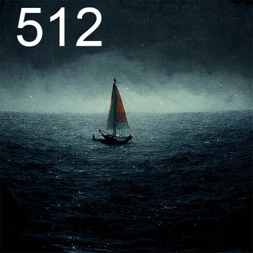
Notice that the sizes are a comma separated list. Here’s what each part means:
(max-width: 990px) 95vw
This means that up to a maximum width of 990px for the viewport, expect the image to take up about 95% of the total screen width. This was just a guesstimate based on the padding around the sides of my site in mobile mode. It then determines what image it needs based on this. If your viewport is 500px wide at 1x, it assumes it needs to load an image that fits into 95% of the view width, so a 475px wide image. It picks the 512 image in this case.
Now, suppose you’re viewing from an iPhone on a viewport 390 in width, and a scaling factor of 3x. The browser understands it needs to load an image that’s 95% of 390, multiplied by three. The product of 390, 0.95, and 3 is 1111. The browser is targeting an image size of 1111px. It will load the larger 1024w image.
It is up to you to determine the breakpoints. The breakpoint for my site between the full-width 1 column layout on mobile and the partial width 3 column layout happens at 990px. Your breakpoint may be different. You may have to experiment with different values, the browser dev tools, and mobile preview many times to get this right! Reload to make sure you’re getting the proper image. Use dummy images with numbers in them like I did if you have to, then replace them later. The good news is, you can re-use the same information for similar images throughout your site, so long as the layout is the same.
(max-width:2000px) 25vw
Now I’m saying up to a 2000px viewport width, assume the image is going to occupy around 30% of the screen’s width. It’s in the first of three columns now. This may not be 100% accurate, but it’s close enough. The image should load at 512 on 1x resolutions between the 990 and 2000px viewport widths. Again, it will load the higher density images if you’re on a high res screen.
435px
The last bit is just saying for anything else, assume the image will be 435px wide. That’s how wide I found it might get at 1x DPR on my site. It will always load the 512w version at this point on 1x DPR monitors. If the user’s 2x or higher, it will load the 1024w since 435×2=870, greater than 512.
Sizes Attribute Assignment/Practice
I’d encourage you to open your favorite HTML editor and web browser. Then practice using the srcset and size attributes on a set of images. If you didn’t quite understand everything I was trying to explain above, practicing yourself might do the trick.
You may use my photos of the mountains if you’d like as a starting point. Create a responsive container in the HTML document. Experiment with different sizes and breakpoints until you feel each image is loading properly in the right situations.
 Responsive Image Size Practice
File name: responsive-image-size-practice.zip
Author: Kevin Olson
License: CC-BY-NC-SA-4.0
Contains images and an HTML template for practicing responsive images
Multiple Sizes with Picture Element
An alternative to appending srcset and sizes attributes to img elements, you may use the picture element to achieve the same things discussed above.
<picture>
     <source srcset="/small.jpg 500w, /med.jpg 1000w" />
     <img src="/small.jpg" alt="a cool picture">
</picture>Code language: HTML, XML (xml)
Suppose I have three variants of an image with widths of 500px, 1000px, and 1500px. This is the behavior I want to get:
- At low viewport widths, under 400px, the image will fill the entire screen with 100vw.
- From 400px to 1000px, the image will be in a two column layout with a width of 50vw.
- Above a viewport width of 1000px, it will be in a three-column layout, so the width is 33vw.
There are two workable ways to achieve the above. First, we will use srcset and sizes in the same manner we did earlier with the img tag. This time, we’ll place them in a picture source element.
<picture>
    <source srcset="/small.jpg 500w, /med.jpg 1000w, /large.jpg 1500w"
       sizes="(max-width: 400px) 100vw, (max-width: 1000px) 50vw, 33vw" />
       <img src="/small.jpg"/>
</picture>Code language: HTML, XML (xml)
The source element also supports the media attribute. You can put a media query here if you’d like, rather than in sizes. Here’s an alternative way to achieve the same effect above.
<picture>
    <source
       media="(max-width: 400px)" srcset="/small.jpg 500w, /med.jpg 1000w, /large.jpg 1500w"
       sizes="100vw" />
    <source
       media="(max-width: 1000px)" srcset="/small.jpg 500w, /med.jpg 1000w, /large.jpg 1500w"
       sizes="50vw" />
       <img src="/small.jpg" alt="a cool pic"/>
    <source
       media="(min-width: 1000px)" srcset="/small.jpg 500w, /med.jpg 1000w, /large.jpg 1500w"
       sizes="33vw" />
       <img src="/small.jpg" alt="a cool pic"/>
</picture>Code language: HTML, XML (xml)
That way’s much longer since we’re using the same 3 images for each source element with a different media query. This is more designed for cases where you want to use different source formats, or entirely differently shaped image per media query. If your goal is to just deliver the same image in multiple sizes, you’re probably better off using the img element with srcset and sizes as explained earlier.
Image Crops
Consider you have a picture taken in landscape orientation, the aspect ratio is 4:3. The subject isn’t filling the entire picture. It looks good without being cropped on wide devices like monitors and tablets. But on smaller devices, like smartphones, the subject is smaller than you’d like them to be. You decide you want to create two versions of the image – a full-size version for larger displays and a cropped version for smartphones.

You may do this using the picture element combined with sources and media queries. We will deliver the cropped photo to mobile users with viewports under 800px wide. For everyone else, we’ll give them the full photo in landscape orientation.
<picture>
    <source
       media="(min-width: 800px)" srcset="/fullsize.jpg"
    />
    <source srcset="/cropped.jpg"
    />

       <img src="/fullsize.jpg" alt="a cool pic"/>
</picture>Code language: HTML, XML (xml)
You can achieve the same effect using a max-width of 799 for the cropped version.
<picture>
    <source
       media="(max-width: 799px)" srcset="/cropped.jpg"
    />
    <source srcset="/fullsize.jpg"
    />
    <img src="/fullsize.jpg" alt="a cool pic"/>
</picture>Code language: HTML, XML (xml)
Here’s a quick demo. Resize the box beyond 800px wide to see the effect.
Combining Crops & Multiple Resolutions
Now let’s combine both the image crop feature with support for multiple different resolution displays. Doing this requires you to make even more variants of your images. You’ll need the original version in each resolution you wish to support, and the cropped version in each resolution you wish to support.
I have went with 3 variations of the full-size image at 500w, 1000w, and 1500w. I’ve made two crop variations – one at 1000w and another at 500w. I’ll use the picture element with multiple sources to define the images. The breakpoint remains at 800px.
<picture>
    <source media="(max-width: 799px)" srcset="/vrkid-500-crop.webp 500w, /vrkid-1000-crop.webp 1000w"/>
    <source srcset="/vrkid-500.webp 500w, /vrkid-1000.webp 1000w, /vrkid-1500.webp 1500w"/>
    <img src="/vrkid-500.webp" alt="a kid using vr"/>
</picture>Code language: HTML, XML (xml)
Crops, DPR, and Sizes
Finally, we can combine the image crop feature with multiple resolutions and tell the browser the sizes beforehand with the sizes attribute.
- The user gets the cropped version up to 800px in viewport width, taking up 100% of the available width
- Above 800px, the user gets the full sized image, but now it’s in the first half of a 50/50 column layout.
- Cropped Variants are: 500w and 1000w
- Full size variants are: 500w, 1000w, and 1500w
- The two-column container never gets wider than 1200px
<picture>
    <source media="(max-width: 799px)" srcset="/vrkid-500-crop.webp 500w, /vrkid-1000-crop.webp 1000w"
            sizes="100vw"/>
    <source srcset="/vrkid-500.webp 500w, /vrkid-1000.webp 1000w, /vrkid-1500.webp 1500w"
            sizes="(max-width:1200px) 50vw, 600px"/>
    <img src="/vrkid-500.webp" alt="a kid using vr"/>
</picture>Code language: HTML, XML (xml)
In the sizes attribute of the second uncropped source, note I used a media query within sizes rather than a separate media window. I know beyond a width of 1200, the container won’t get any larger. Since there are two columns, the image will have a maximum width of 600px. If I didn’t do it this way, I wouldn’t be accounting for a situation where the user is on a 1x DPR ultrawide monitor. If the user’s viewport width is 3440px on an ultrawide, and I set the sizes attribute to just “50vw” it would load the 1500w image when it should have loaded the 1000w image.
Art Direction
The direction your artwork flows, especially for illustrations, is important. Imagine you want to share a flowchart on your website. It’s a business process or something you want to show to your clients. It will look great on desktops. However, on mobile devices, it may appear too shrunken down. If the illustration has text, it may become hard or impossible to read. In this scenario, it may be beneficial to have two different versions of the flowchart, each containing the same information, but arranged in a different layout.
Here’s a flowchart I created that looks OK on desktop.

Here’s what it might look like on a smartphone:
That’s not a great user experience. You may still read it on high-res displays, but the text will be small. On low res, small displays, the text will be impossible to read. You can load the image separately when the user clicks it, so they can side-scroll over it, but we should avoid this.
The better solution is to create a new version of the diagram, arranged from top to bottom rather than across the screen.

Now, with the picture element we learned about earlier, we can display the original version on desktop and the narrow version on mobile.
<picture>
    <source
        media="(min-width: 800px)" srcset="/original-diagram.svg"
    />
    <source srcset="/mobile-diagram.svg"
    />

    <img src="/mobile-diagram.svg" alt="How to run a phone store"/>
</picture>Code language: HTML, XML (xml)
Depending on your source material, graphic design skills, or other constraints, creating two versions of your diagrams may not always be viable. If that’s the case, try to pick the images that look best on mobile and flow from top to bottom rather than side to side. If you’re working with graphic designers, and they’ll only provide one image, request the mobile friendly version. It may look somewhat odd on a desktop monitor, but it’ll still be usable. Avoid making users on mobile devices side scroll at all costs. It breaks the standard expected user experience.
Considering Multiple Image Formats
Please read the guide on web image formats if you’re not familiar with selecting and using multiple image formats on the web.
Consider the picture of the boy playing with the VR headset from earlier. We made a cropped version for mobile, and a full-size version for desktop. Now suppose we want to achieve that same effect, but we want it to load WebP first. If it can’t load WebP, it will load JPGs as a backup option. Also, the image takes up the full width of the viewport up to 800px, but above that only half the viewport (two column layout), up to a maximum image width of 600px. So we need to use source elements with srcset, sizes, media, and type attributes.
I started with 5 files, 2 cropped mobile files at 500w and 1000w. Then three original variants with 500w, 1000w, and 1500w. So I had 5 webp files. Now I need to create a jpg version of each of them, for a total of ten images.
I now have the cropped files: vrkid-500-crop.webp, vrkid-500-crop.jpg, vrkid-1000-crop.webp, and vrkid-1000-crop.jpg, and I have the uncropped versions vrkid-500.webp, vrkid-500.jpg, vrkid-1000.webp, vrkid-1000.jpg, vrkid-1500.webp, and vrkid-1500.jpg.
Making this work is simple enough since I already made most of the code earlier in the Crop section of the guide. I can just use the code I created there and add the different versions as separate sources.
<picture>
    <source media="(max-width: 799px)" srcset="/vrkid-500-crop.webp 500w, /vrkid-1000-crop.webp 1000w"
            sizes="100vw"
            type="image/webp"
    />
    <source media="(max-width: 799px)" srcset="/vrkid-500-crop.jpg 500w, /vrkid-1000-crop.jpg 1000w"
            sizes="100vw"
            type="image/jpg"
    />
    <source srcset="/vrkid-500.webp 500w, /vrkid-1000.webp 1000w, /vrkid-1500.webp 1500w"
            sizes="(max-width:1200px) 50vw, 600px"
            type="image/webp"
    />
    <source srcset="/vrkid-500.jpg 500w, /vrkid-1000.jpg 1000w, /vrkid-1500.jpg 1500w"
            sizes="(max-width:1200px) 50vw, 600px"
            type="image/jpg"
    />
    <img src="/vrkid-500.jpg" alt="a kid using vr"/>
</picture>Code language: HTML, XML (xml)
Phew! That’s a rather insane amount of code to just load one image. Not to mention the time it took me to create and save all 10 versions of the image.
An alternative is to just have one jpg as a fallback image, and prioritize making the WebP images work appropriately. Now I only need to create 5 WebP images and 1 jpg.
<picture>
    <source media="(max-width: 799px)" srcset="/vrkid-500-crop.webp 500w, /vrkid-1000-crop.webp 1000w"
            sizes="100vw"
            type="image/webp"
    />
    <source srcset="/vrkid-500.webp 500w, /vrkid-1000.webp 1000w, /vrkid-1500.webp 1500w"
            sizes="(max-width:1200px) 50vw, 600px"
            type="image/webp"
    />
    <source srcset="/vrkid-500.jpg"
            type="image/jpg"
    />
    <img src="/vrkid-500.jpg" alt="a kid using vr"/>
</picture>Code language: HTML, XML (xml)
Final Considerations
From creating all the image variants to determining all the breakpoints, manually creating several variants of images is a lot of work.
Before undergoing this process, determine if it’s really necessary. Use site analytical tools to determine how much of your user base is actually using retina displays. Will they even notice a difference if you serve high res images? If only 1% of your user base is on a 4k display, it might not be worth the effort of serving high-res images to them.
Creating multiple variants of each image can save you bandwidth on low-res displays, but may cause higher bandwidth usage if you send a lot of high-res images. It also takes up more space on your web server, if you’re hosting them directly.
It may make sense to only provide multi-res versions of your most important images. Things like full screen cover photos, large banners, and full view background images.
On small devices like smartphones, even if it has to blow up the 1x image by 2x or 3x because you didn’t provide the high res options, can you tell? On small screens like iPhones, I find it doesn’t make much of a difference. It makes more of a difference on larger high-res displays like iPads and 4k monitors.
Summary/Outline
- The simplest way to make any image responsive is with CSS. With limited exceptions, you’ll want to do this every time.
img{ max-width: 100%; height: auto;}
- The Device Pixel Ratio is the ratio of device/actual pixels to browser/css/viewport pixels.
- High res screens may have 2x, 3x, or even 4x DPRs.
- It’s based on width and height. A 500×500 image in actual resolution pixels at 1x is a 1000×1000 image at 2x DPR and 1500×1500 at 3x.
- You can define the natural width of an image with a ‘w’ following the image name in the srcset attribute on a source or an img element
srcset="mypic500.jpg 500w, mypic1000.jpg 1000w"- This loads the right image with respect to the total width of the browser viewport and the device’s DPR if you don’t specify a sizes attribute
- You can use DPR sizes in a srcset with 1x, 2x, etc. if the image doesn’t expand or contract with its container
srcset="mypic500.jpg 1x, mypic1000.jpg 2x"
- Use the sizes attribute in combination with the srcset attribute to tell the browser the expected width of the loaded image.
- This is like a hint for the browser on the layout of the page after it’s fully loaded
- You can account for the container sizes and breakpoints in your grid/column systems with media queries
- The final size in the comma separated list should be the width of the image at 1x when its container is at its maximum width
- You should use the picture element if you plan on serving different images to users based on their device type
- You may use this to serve a cropped image to mobile users and a fuller image to desktop users
- You may use this to serve separate mobile and desktop variants of your illustrations, charts, etc. to different clients based on the art direction that makes sense
- You may use this in combination with the type attribute to include fallback image types
- The picture element should contain source elements and one img element
- The CSS classes and alt text should be applied to the img element, not the picture element or the source elements
- Actual results may vary depending on user’s device/browser and browser settings. Test your site across multiple devices to see the actual results.
Alternative Options and Automation
You will drive yourself insane if you manually account for every possible responsive image situation on your site. Unless you’re creating a tiny site with limited images, it probably makes little sense to do it all yourself.
There are many ways to automate creating image variants. Plugins or extensions exist for WordPress, Joomla, and other major CMSes to help. They allow you to upload a single, high res version of an image, and automatically scale it accordingly.
If you use a CDN to deliver your images, there may be options which automatically scale the right versions. You can run scripts on Cloudflare, AWS, DigitalOcean, and many others which automatically generate scaled versions of the images. They can even automatically serve fallback image types to older browsers.